Summary
One sentence summary
A way of comparing how much suffering different interventions reduce, without requiring weightings between intensities.
Two Paragraph Summary
The Cumulative Pain Framework is a system to quantify the pain of animals. The CPF is useful because we want to know which factory farming practices are causing the most suffering, so we can prioritise reforming them. The framework involves categorising the pain into different intensities, along with the duration of time spent in these intensities. A problem with the framework is that there is no accepted way to quantatively compare between the intensities (e.g. which is worse, 5 minutes in a high intensity pain, or 45 minutes in a lower intensity?).
There have been attempts at estimating the weighting between different intensities in order to create a unified pain metric, but so far this has had limited success due to the scarcity of relevant studies on humans, not to mention species of farmed animals. In this report I take a different approach, where instead of collapsing the four dimensions into one, we instead see how far we can get while maintaining the distinctions.
Brief introduction to the Cumulative Pain Framework
In the Cumulative Pain Framework (CPF), pain is thought of as the cumulative load of negative experiences. The magnitude of pain is characterised by its intensity, and its duration. The CPF defines 4 different pain intensities, ranging from mild pain (called Annoying), to the most extreme pain (called Excruciating). The framework is based on estimating the probabilities that the animal is in the different pain intensities, and this is multiplied by the duration of the pain, in order to find the estimated amount of time that the animal spent in each of the types of pain. In the framework, the four intensities are kept separated and are not combined.
In theory, many different forms of information can be used to estimate the pain intensity (e.g. brain scans, body temperature, heart rate, etc), but in practise it is usually just the behaviour of the animal that is used. Behaviour is probably a good indicator of pain, as the evolutionary point of pain is to change behaviour.
A question which will quickly come to mind when thinking about this framework, is how can you quantitatively compare between pains intensities? Clearly Disabling pain is worse than Hurtful pain (by definition), but how much worse? 50% worse? 3 times worse? 1000 times? Unfortunately there is still no clear answer to this question.
Thankfully, in many cases we don’t need to know how to compare between pain intensities in order to still know which intervention reduces the most pain and should be prioritised, e.g. If Intervention A reduces more time in pain in every intensity than B, then it is obvious that A is superior.
| Int A | Int B | |
|---|---|---|
| High intensity pain reduction | 10 | 8 |
| Low intensity pain reduction | 15 | 12 |
This table shows that Intervention A reduces more pain in both[1] intensities than B, so it’s definitely superior (remember, we’re looking for interventions which maximise the pain reduction, so bigger is better).
However, if Intervention A reduces a bit more time in a high intensity pain than B does, but a lot less time in a lower intensity pain, then suddenly we lose the certainty. We cannot make an informed decision between these two options without some idea of how much worse the high intensity pain is than the lower intensity pain.
| Int A | Int B | |
|---|---|---|
| High intensity pain reduction | 10 | 11 |
| Low intensity pain reduction | 15 | 6 |
One way of getting around this problem is by using a really cool mathematical framework called multi-objective optimisation.
Multi-Objective Optimisation
As the name suggests, multi-objective optimisation is the process of optimising multiple different objectives simultaneously. When the different intensities of pain are thought of as separate quantities to minimise, then it is clear how this mathematical tool can be helpful. As a bonus, it also has the rather pleasing bovine acronym of MOO.
To show how MOO is normally used, we can consider using it to help us choose which apartment to rent. When choosing a new apartment, there are a number of factors to consider, but let’s pretend there are only two, floor area (measured in square meters), and how much you like its location (rated on a scale of 1 to 10) (forget about rent for the moment, we’ll come back to that). We are interested in finding a flat which has the largest area, and nicest location. Obviously everyone would rather a more spacious flat and a nicer location, but it's not very clear how they should be related, i.e. how much floor space should you be willing to give up to move to a slightly nicer neighbourhood? What is clear however, is that if there is an apartment which is both more spacious and in a nicer neighbourhood than another, then it's a superior choice. In fact, for a choice to be preferable it does not need to be superior in both dimensions, but only superior in one, and at least equal in the other. What is tricky is when a choice is better in one dimension, but worse in another.
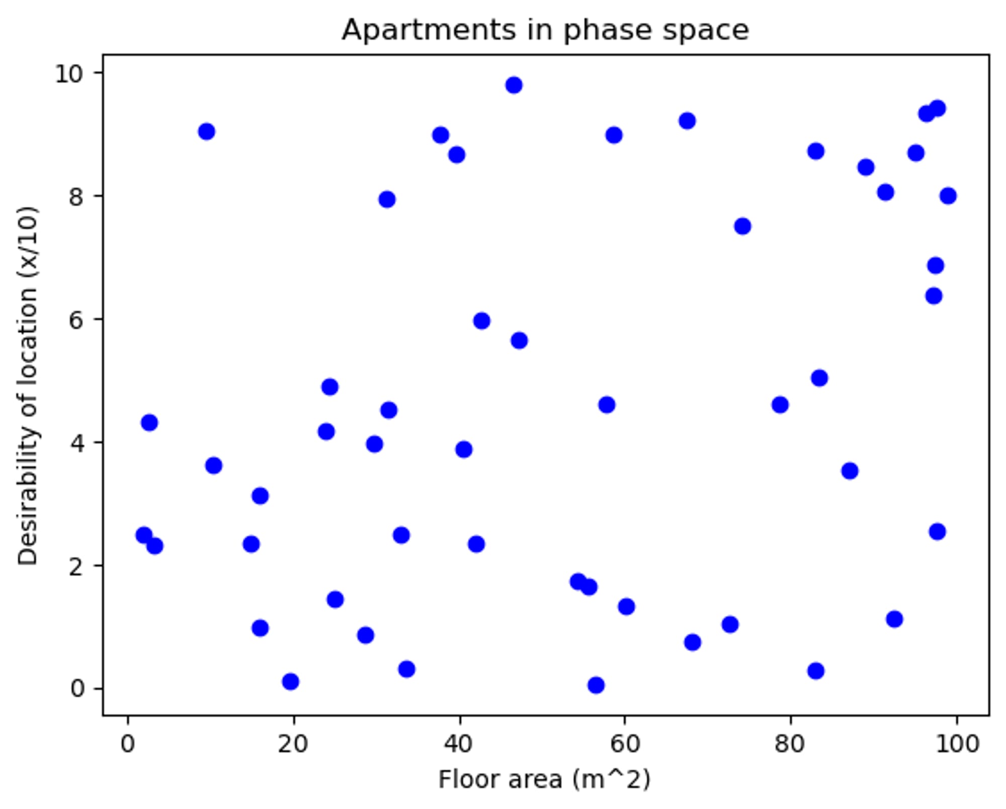
Below we can see a single apartment option. Any apartment which has a smaller area and less convinient location than this is clearly inferior (any point in the bottom-left quadrant), any option which has a bigger area and nicer location is clearly superior (top-right quadrant), and if an option has a larger area but less nice location, or smaller floor area and nicer location, then we don't immediately know how to feel about it (in the bottom-right and top-left quadrants respectively).
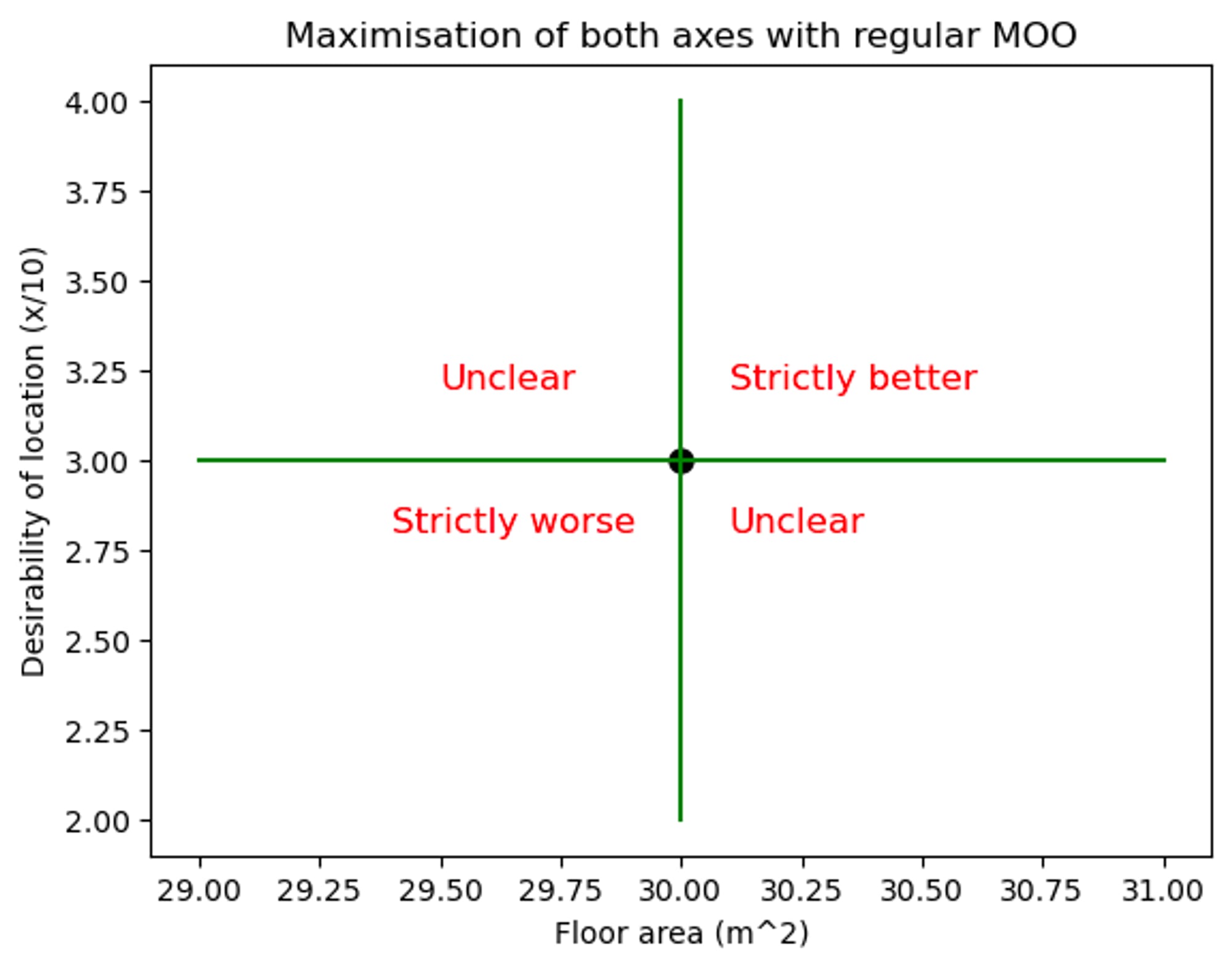
MOO is used to select the few points which are not obviously inferior to any other point in the set, i.e. any points which are not in the “strictly worse region of any other points”. These points are called the pareto frontier. MOO cannot help us decide which of the points in the pareto frontier is the best of the best, as all of the points of the pareto frontier lie in each other’s “Unclear zones”.
The pareto frontier of this set is shown here in red:
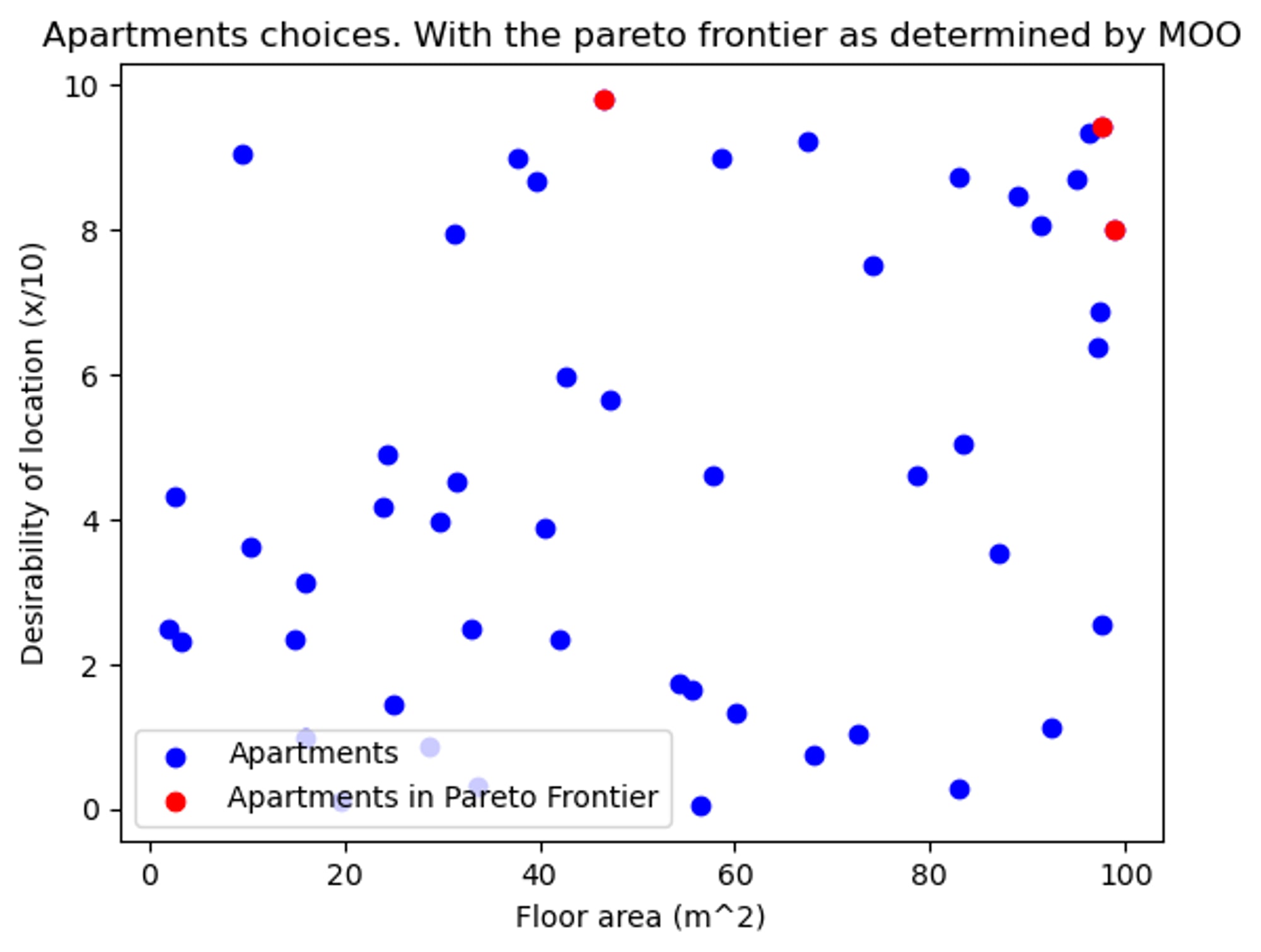
So now our shortlist comprises the three red points, and we can forget about the rest! Note that MOO cannot help us decide between these three, to do that we would need some way of expressing our desire for a great location in terms of our desire for spaciousness.
Now, of course in reality we also care about the cost. We can incoporate this by scaling each of the apartment vectors by the inverse of their rent, this will help us find the apartment which gives us the most space and nicest location per dollar. In reality, this scoring system might not be very helpful in deciding on a flat, as this framework might point us towards a flat which has a great value of square meters per dollar, but as the size of the flat is so huge, the rent is unaffordable, even if it is better value than a more affordable option which we end up picking. Or maybe there are diminishing returns to how much space we can appreciate, and so a really huge flat might not be worth the additional cost. However, these criticisms don’t apply to finding cost effective interventions, as we are always looking to reduce more suffering.
Multi-Objective Optimisation and the Cumulative Pain Framework
This mathematical tool has obvious relevance to our goal of ranking pain events, as the Cumulative Pain Framework has different types of pain and we want to minimise all of them, but we don't understand how they are related.
When we’re deciding on how to best help animals, we are not really looking for which pain-event is least painful (a minimisation problem), but we are looking for which intervention reduces the most pain. This is a maximisation problem, similar to the apartment example above, where now each of the dimensions is a different pain intensity.

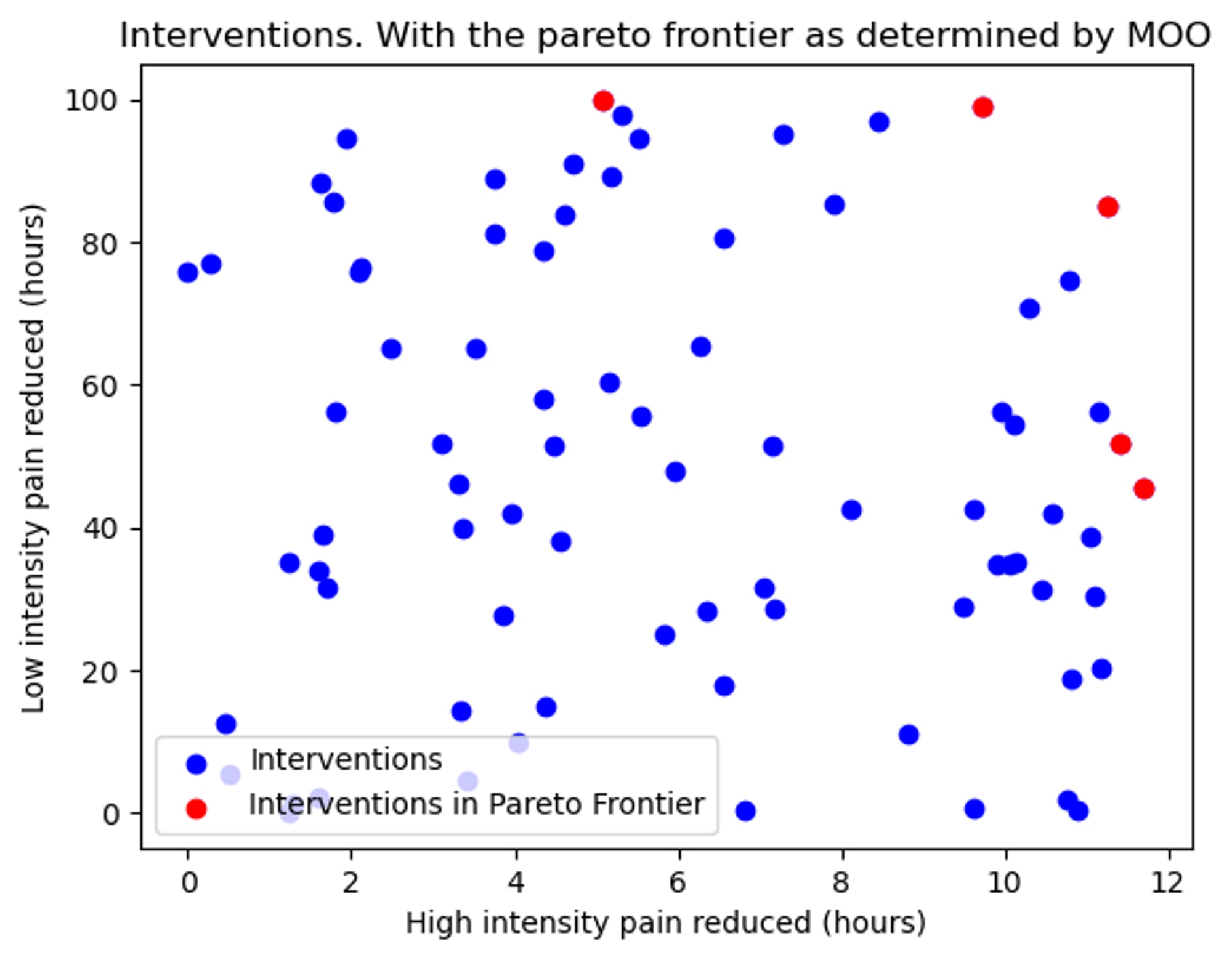
However, one piece of information that we are lucky to have and is not normally included in MOO, is the hierarchy of intensities of the CPF. In the spaciousness-vs-location example, we don't know if it is a good thing to trade-off 1 unit of area in return for 1 unit of location-desirability. But due to the way that the pain intensities are defined in CPF, we do know that 1 minute of high intensity pain is worse than 1 minute of low intensity pain.
This means that we can narrow down the regions of uncertainty (as shown below in the POV of a single point).

This is because we should be happy for an intervention to reduce an additional minute of high intensity pain even if we have to accept an additional 1 minute of low intensity pain in return (and it is not analgously true that we should be willing to trade off 1 square meter in return for 1 unit of location-desireability). This allows us to decrease the pareto frontier further than we could otherwise, which is great news, as we are narrowing down the list of best interventions!
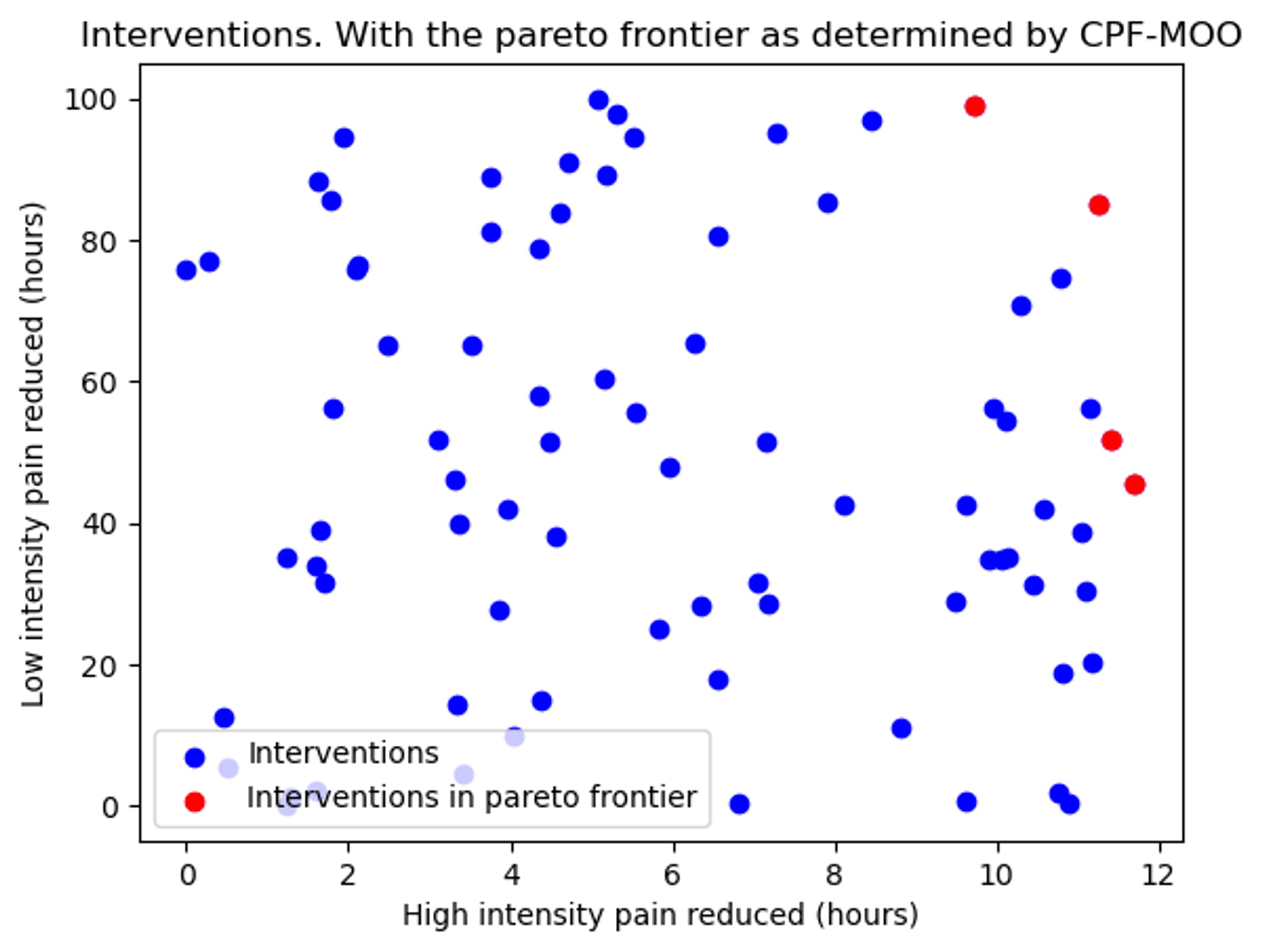
In fact, as each intervention will have a different cost, what we actually care about is finding which intervention reduces the most suffering per dollar, i.e. finding the most cost-effective interventions. A good way of doing that is scaling each of the interventions by the inverse of their cost, which is equivalent to plotting the reduction of pain per dollar.
Conclusions
While the graph showing MOO narrowing down the options looks very cool, in reality this is mostly quite obvious and MOO isn’t really telling us much that we didn’t know already. The hard part is deciding between the points in the pareto frontier (and this is the topic of the next post, coming in a few days here).
I hope it is clear that while the whole point of this piece was to see how far the CPF can go without knowledge of how to relate between intensities, the techniques described here will be much more powerful when there are upper and lower bounds for the weights. As our knowledge of this field grows, we will start to narrow the confidence intervals of the weights, squeezing the unclear regions down smaller and smaller, giving us more confidence in choosing one intervention over another. As an example, in this report we found a paper which suggests that the Disabling intensity is between 94 and 496 times as bad as the Annoying intensity, and so this could be incorporated into the system, making the “unclear” sections much narrower.
If we had a large amount of data about different interventions and we needed a systematic way to sort through them to find the most cost-effective ones, then this system would be helpful. However, a far bigger bottleneck than data-processing is data-collection, so this system probably has limited value in the current state of things, but I expect it to become more useful over time.
I would like to thank the following people for fruitful discussions on this topic (listed alphabetically):
Wladimir J. Alonso, Jonas Becker, Tamas Madl, Isidor Regenfuß, and Cynthia Schuck-Paim
- ^
While the cumulaltive pain framework has 4 intensities of pain, this post will only use 2, as it is much simpler to explain that way, and this system also works in 4d.

Thanks — this was helpfully accessible to my not-very-mathsy brain!
(Without going through part 2 and the mathematics)After going through part 2: Good job! I hope to see this model in use sooner or later!
Thanks for writing such a useful post!
Upon observing the pattern, I can see why you stated in the conclusion that the graph would be mostly quite obvious. The high-intensity pain with maximum time reduction would always move to the Pareto frontier. This would be directly responsible for the pain of Disabling variety—the motive of most factory farming practices, for reduced manufacturing costs and efficient storage.
I think the mentioned Multi-Objective model can be quite handy. We can incorporate it for cost-effective intervention analyses. But I think we can also use it to achieve the prerequisites required for estimating better Pareto frontier data.
Of course, Behaviour is probably a good indicator of pain, as the evolutionary point of pain is to change behaviour. One caveat though is change in behavioral patterns after long periodical treatments. For example: the case of cattle would be different from hens and chickens. That data can be obtained from authentic monitoring and testing (a fundamental bottleneck).
P.S. I think this is an important consideration.
Thanks a lot for your thoughts!
I like your first point, that the intervention with the greatest reduction in highest intensity pain will always be in the Pareto frontier (as the 6th image shows, any point to the left of another will either be "unclear" or "strictly worse", but never "strictly better"). I hadn't considered that before!
I don't think I understand your second or third points though.
Namely this line:
And this line:
I don't understand the distinction you're making between cows and chickens.
Thanks again for your comment!