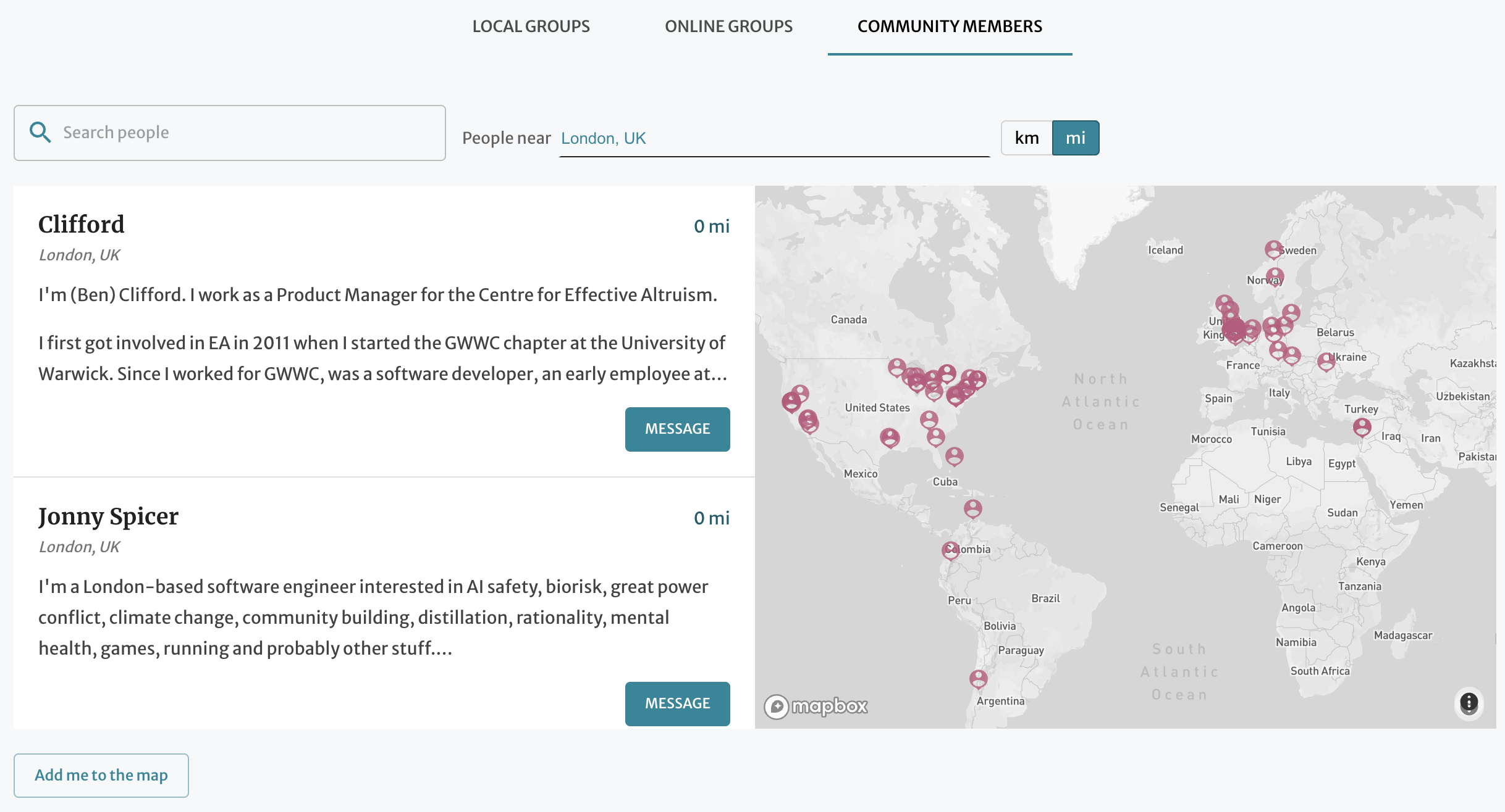
We've added a new tab to the "Community" page with a map of community members!
We invite you all to add yourselves to the map. :) Anyone with a Forum account can do so.
Note that the location you select will be publicly visible, so please only do so if you are comfortable sharing.

You can also use that page to search the text of other users' bios. Over the next few months, we will be expanding forum user profiles and adding other ways to search for users. We won't share any personal information that users don't opt into sharing.
We welcome feedback! Feel free to comment on this post, leave a note on the EA Forum feature suggestion thread, or contact us directly.

This is great! Connecting to people close to my city was crucial for my (still short) EA journey. Don't be afraid to reach out to anyone, almost all EAs I encountered were happy to chat!
This is *so* cool, thanks! Might be nice to have a feature where people can add a second location. E.g. I used to study in Munich, but spend ~2 months per year in Luxembourg. Many friends stayed much longer in Luxembourg. According to the EA survey, there are Luxembourgish EAs other than me, but I have so far failed to find them --- I'd expect many of them to be in a similar situation.
I recommend you add that in your bio, since the text search will match on both the map location and any text written in your bio. :)
Great feature! It would be nice if the location listed on users' profiles linked to the map. This would better integrate this functionality with the rest of the EA Forum. Currently, when a user clicks on someone's profile and sees a city listed under their name, there is no indication that this is part of a map of community members.
Thanks, I like that suggestion!
Thank you for implementing my suggestion!
I’m on mobile & don’t see the add me button available.
Given the limited real estate on mobile, I decided to hide the map and the "add me" button there. I figured the primary use case for mobile would be searching the list of users. Let me know if you have any specific mobile UX suggestions.
I think it could be worth still showing the button on mobile, but then making it display a notification saying that this is only supported on desktop? Or some other way of suggesting people switch to desktop? Otherwise, mobile users who are trying to add themselves to the map will keep looking for how to do it before getting discouraged and giving up.
Copy that, thanks. I primarily access the forum on mobile. Not sure if that’s the overall trend though.