TL;DR: We now have dark mode on the EA Forum. There are some bugs, but you can turn it on!
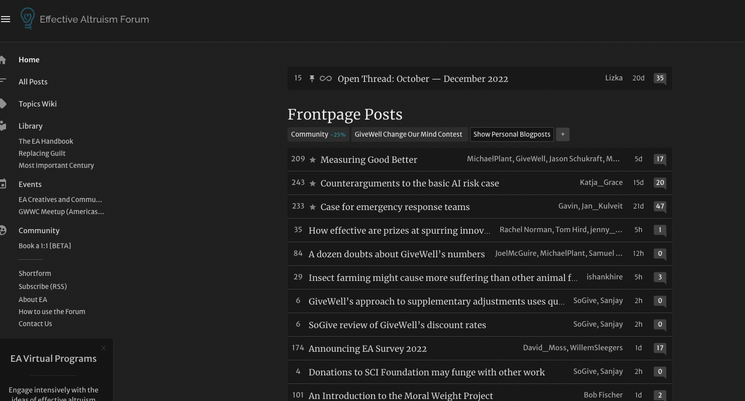
This is what the Frontpage looks like in dark mode:

How to use it
You need to be logged in — the Forum will respect browser settings for logged-out users.
To change light/dark mode settings, hover over your username in the upper right-hand corner (or just go to your profile page). Then select “Account Settings.” In account settings, click on “Site Customizations” and click on the dropdown under “Theme.”

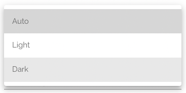
You’ll see three options:

- “Auto” will respect your browser settings, even if you have a setting that varies your mode by time of day or the like (e.g. if you set your browser to be light during the day and dark in the evening and at night)
- “Light” will be light — the Forum you might be used to.
- “Dark” will always be in dark mode.
Feedback is (always) welcome!
Please also feel free to report bugs in the comments of this post.
Thanks to everyone who worked on this. :)


If possible, an easier way to change between dark/light mode, like a switch on the top right menu, would be great.
Can I ask what use case you have for this? Are you switching it multiple times a day (like with sunrise-sunset? If so, can I ask what operating system you're using?
I’d switch depending on the time of day, device I’m using (phone or computer), and lighting situation, as I read the forum a lot on the go. I use Chrome and Firefox.
On Mac, Windows, Android, iOS?
Windows and iOS. (I now realize you asked for the OS and I read browser , sorry)
Mac, Android and iOS already have a version of dark mode that changes on the time of day. You can then set your EA Forum them to "Auto" and forget it. Unfortunately, windows doesn't have such a mode, but you might find this does the job.
I'd be curious for more info about your non-time of day lighting desires, but would need to hear of more examples of this before devoting such prime real estate to something that right now I'm modeling as pretty niche.
Some situations in which I appreciate light/dark switches in general:
But I know your time is quite valuable and I don't have a good sense of how effortful it'd be to implement this, so take this suggestion as something I'd consider nice-to-have but have absolutely no strong feelings about it.
Just wanted to say it looks really good! Especially on mobile! Good work!
Dark mode is too stronk, especially on mobile phones.
The background is too dark (
it's literally black)and the the text is too close to white.Notes:
Here is a good suggested setting (from Apple reader):
Adding flavors of dark mode seems good.
Moderator comments behave weirdly in dark mode
This (and your other comment about tables in posts) should now be fixed - thanks for letting us know!
Thank you! 💖
https://forum.effectivealtruism.org/posts/nDgCKwjBKwFvcBsts/corporate-campaigns-for-chicken-welfare-are-10-000-times-as#Cost_effectiveness_of_GiveWell_s_Maximum_Impact_Fund1
Tables: