What’s new:
- React to posts
- Explore featured content on “Best of the Forum”
- Redesigned “Recent discussion”
- Right sidebar on the Frontpage
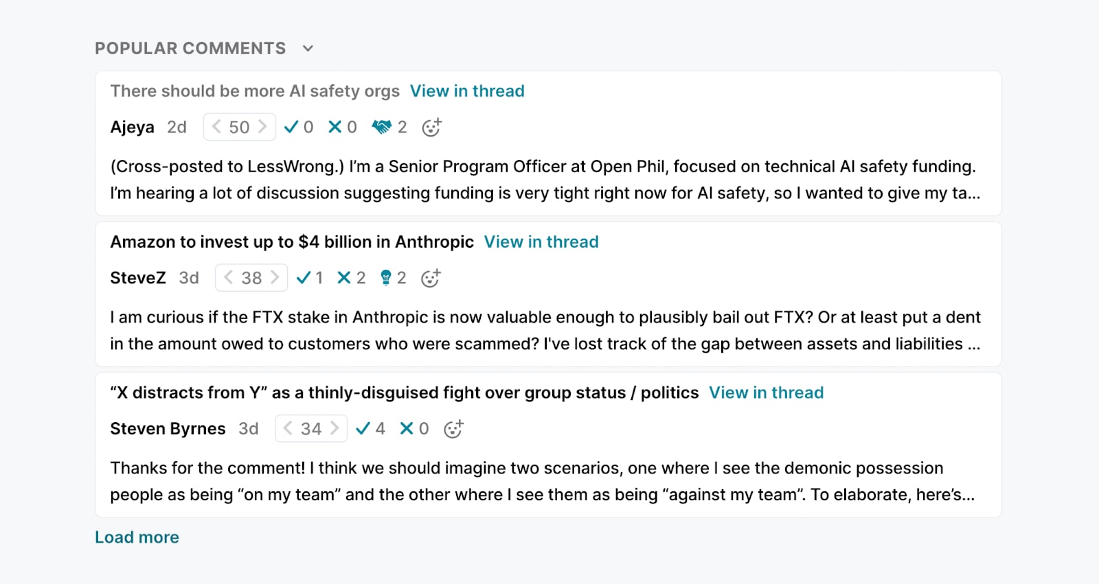
- “Popular comments” on the Frontpage
- Updated recommendations on posts
- Improved author experience
Most of these changes are aimed at broadly improving discussion dynamics and surfacing more high quality content on the Forum.
I'd love feedback on these changes. You can comment on this post or reach out to us another way. You can also share your feature requests in the feature suggestion thread.
React to posts
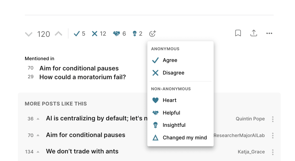
Reactions on comments have grown in popularity since we launched them two months back, and we've now added reactions to posts. One of the goals of post reactions is to allow readers to share feedback with authors without the effort of leaving a full comment.
Just like for comments, agree/disagree reactions (and regular upvoting/downvoting) are anonymous, while other reactions are non-anonymous.
Explore featured content on “Best of the Forum”
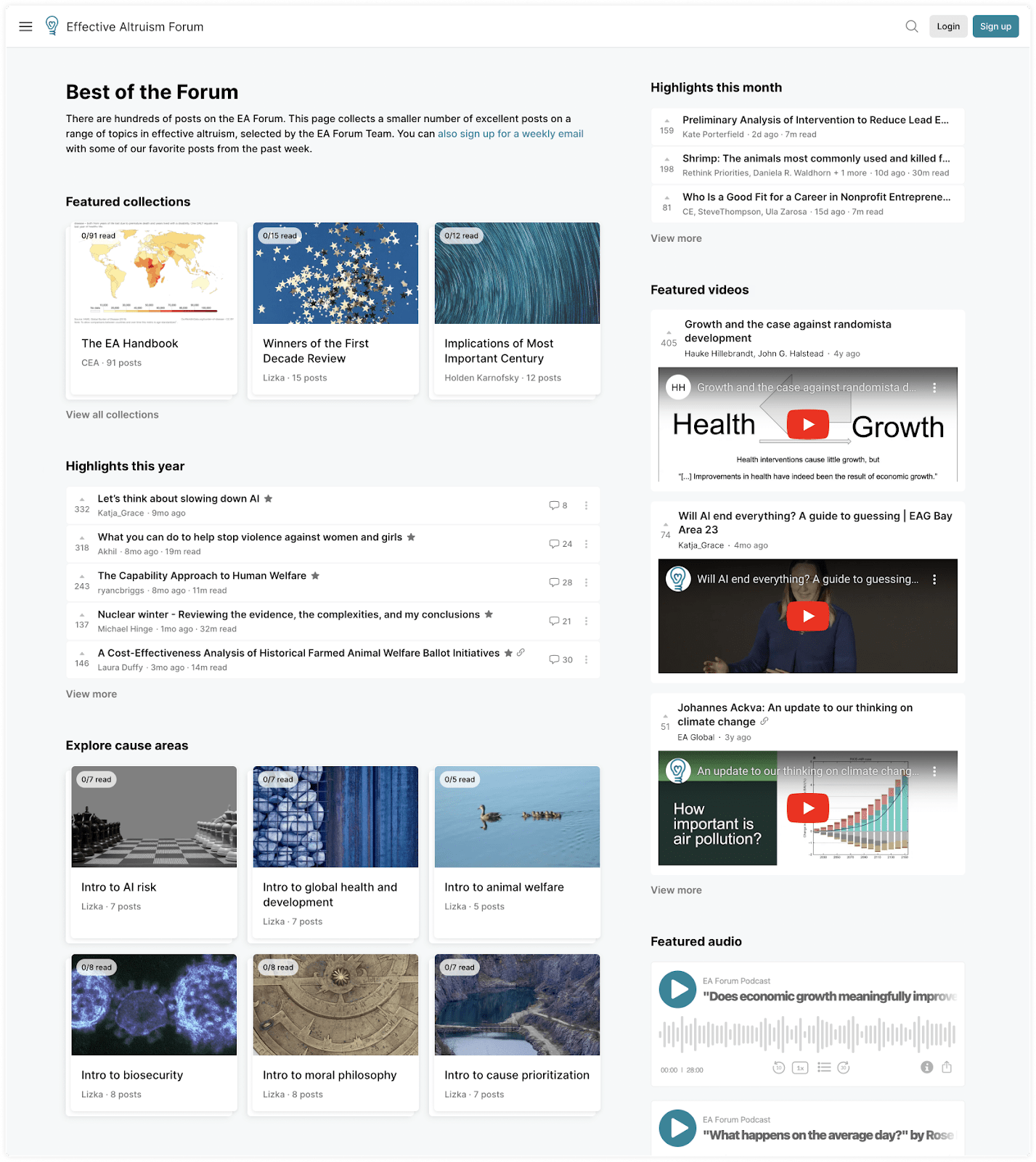
We have a new “Best of the Forum” page that features selected posts and sequences curated by the Forum team. It replaces the Library page in the left navigation on the Frontpage (you can still explore all sequences on the old Library page).
New users often feel overwhelmed by the amount of content to choose from; I’m hoping they will be able to use the page to find highlights and get a sense for what the Forum is about. Experienced users who visit the Forum more rarely might also be able to use it to catch up on top posts from the last month.
Redesigned “Recent discussion”
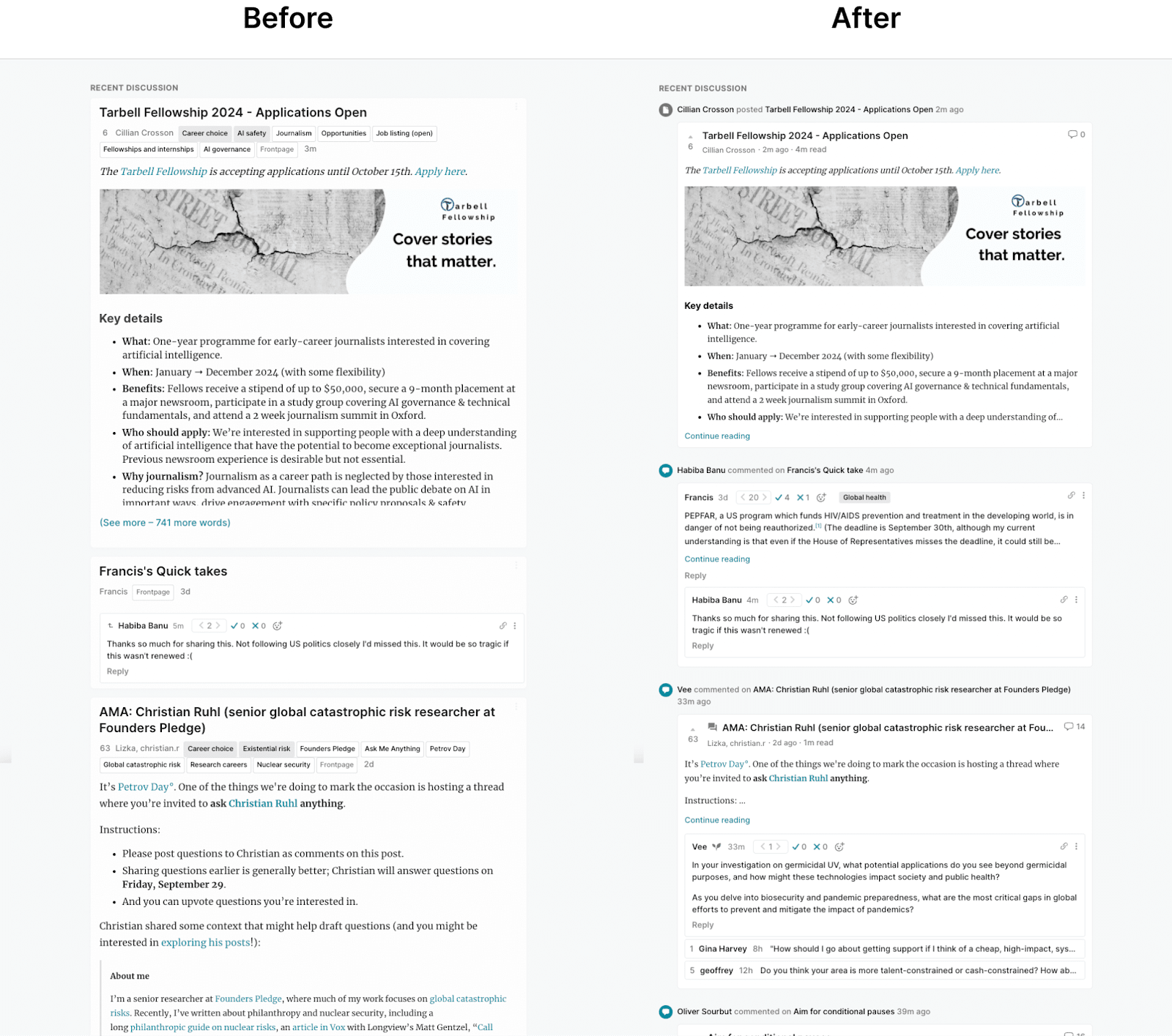
I've redesigned the “Recent discussion” section on the Frontpage to use a timeline UI to highlight what type of update you’re looking at (new comment, post, quick take, event, etc.).
The “Recent discussion” section is popular among heavy users of the Forum — helping people keep up on recent activity and find discussions they’ve missed. But we’ve found that many Forum users were confused and overwhelmed by it. This redesign aims to clarify what "Recent discussion" is about, and make it easier to parse.
Right sidebar on the Frontpage
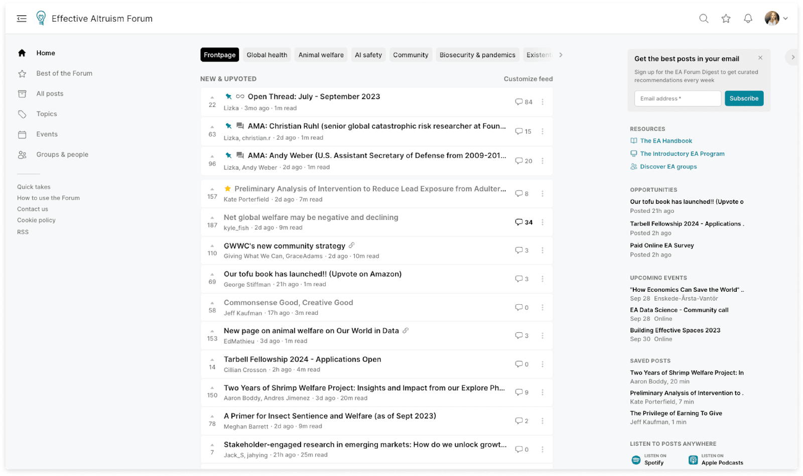
We’ve added a right sidebar to the Frontpage to highlight resources and make it easier to find opportunities and events (we'll add and remove resources based on usage and feedback). Logged in users can hide the sidebar, and you can update your location to get better event recommendations.
“Popular comments” on the Frontpage
Users sometimes miss out on great discussions taking place on the Forum. To help surface these discussions we’re trying out a “Popular comments” section. It features recent comments with high karma and some other signals of quality.
You’ll find the section below Quick takes. As with most other sections on the Frontpage, you can collapse it by clicking on the symbol next to the section title.
Updated recommendations on posts
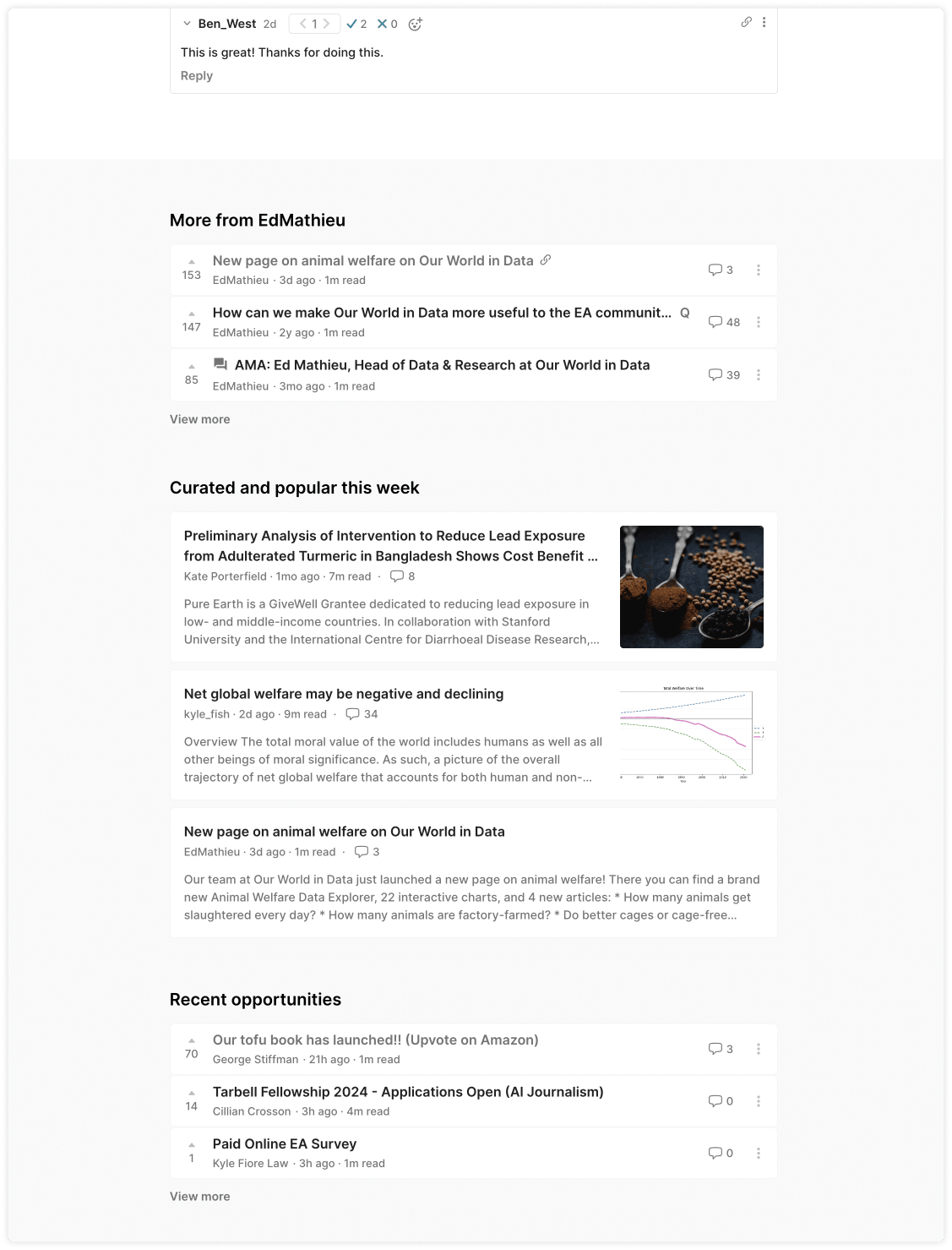
Below post comments, you’ll now find:
- More from this author
- Curated and popular this week
- Recent opportunities
We’ve been experimenting with recommendations on post pages. We’ve tried a few things (we decided to get rid of right-hand side recommendations since usage was low and a few users found them distracting) and are now adding recommendations to the bottom of posts. Like previous recommendation experiments, we’ll monitor user feedback and click rates to decide next steps.
Improved author experience
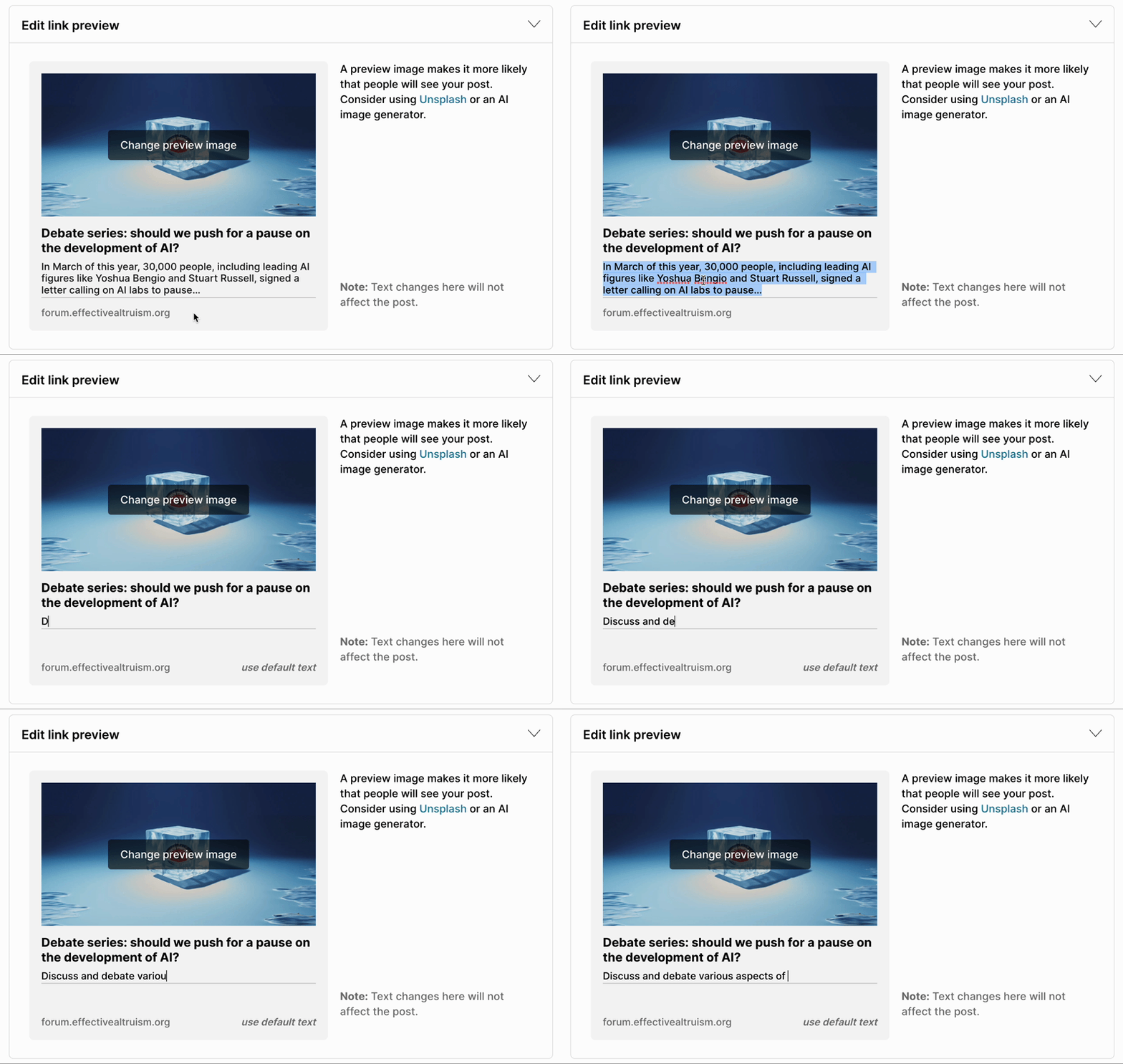
Add custom text to social media link previews
Authors can upload an image to use for link previews when their post is shared on social media (or elsewhere). Now authors can also set the text that shows up in those previews. This won’t affect the text of the post.
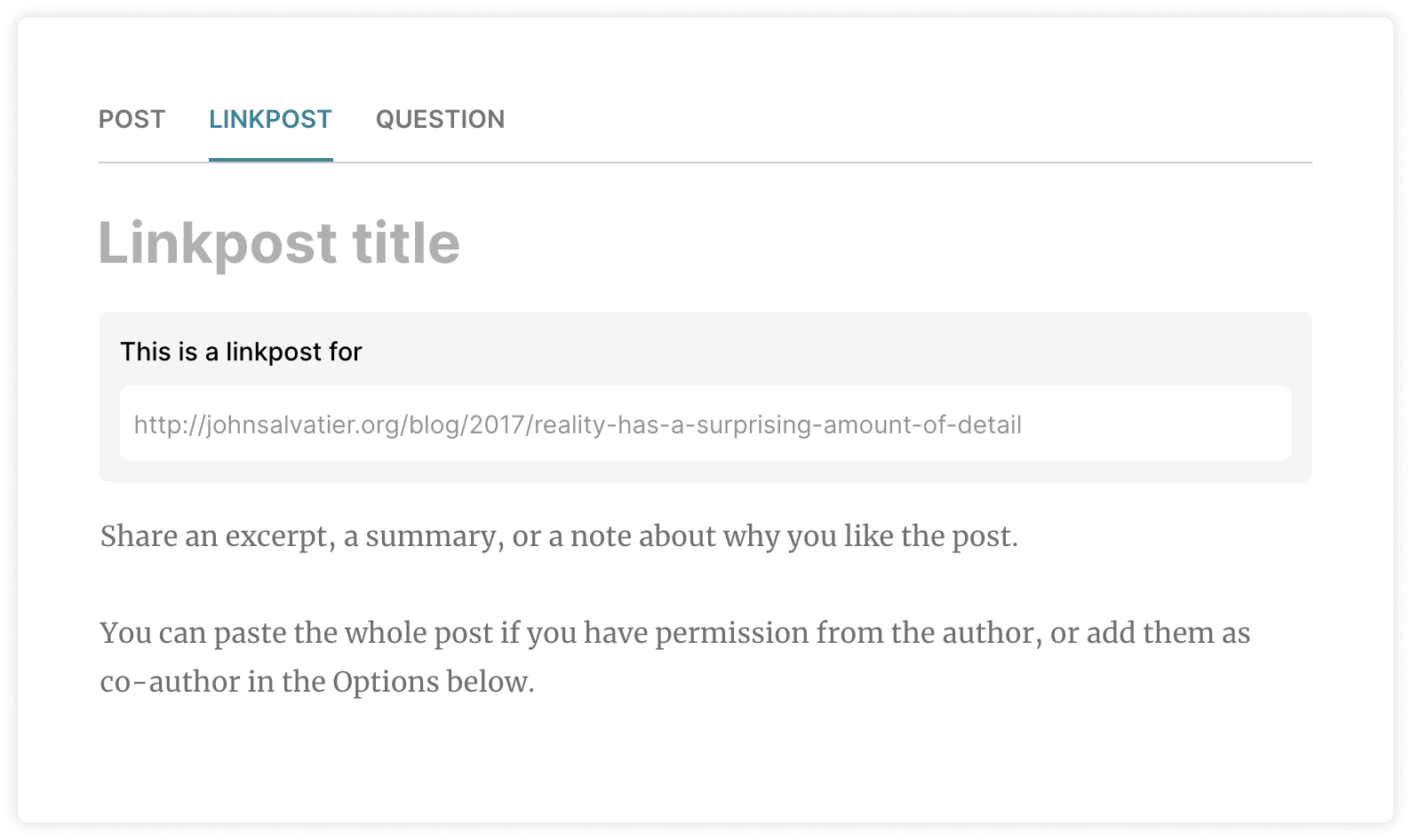
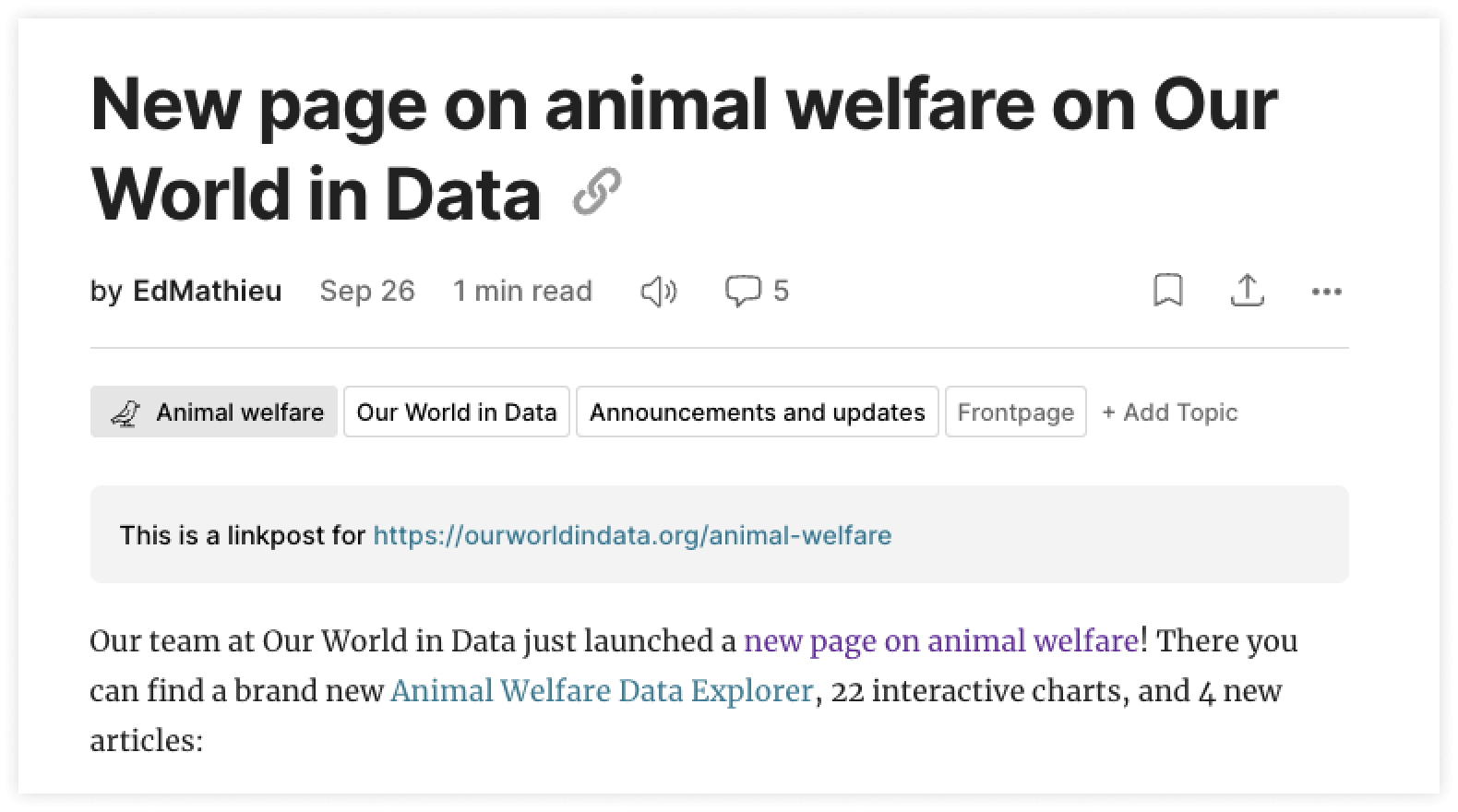
Linkposts have been redesigned
When you want to share a linkpost you now click on a tab on the draft post page and add the link inside of a grey block. Published linkposts will display the grey block at the top of the post.
Many users were confused by how linkposts worked (both during post creation and when reading a post). It was hard to tell what it would look like once you publish, and the link in the published post was styled as if it was part of the post’s body. The new design tries to make the draft page as similar as possible to the published post.
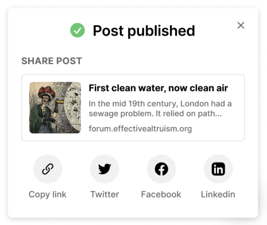
Prompt to share your post after publishing
To make sharing your post easier we've added this brief prompt. It appears in the bottom right corner of the screen once you hit publish.
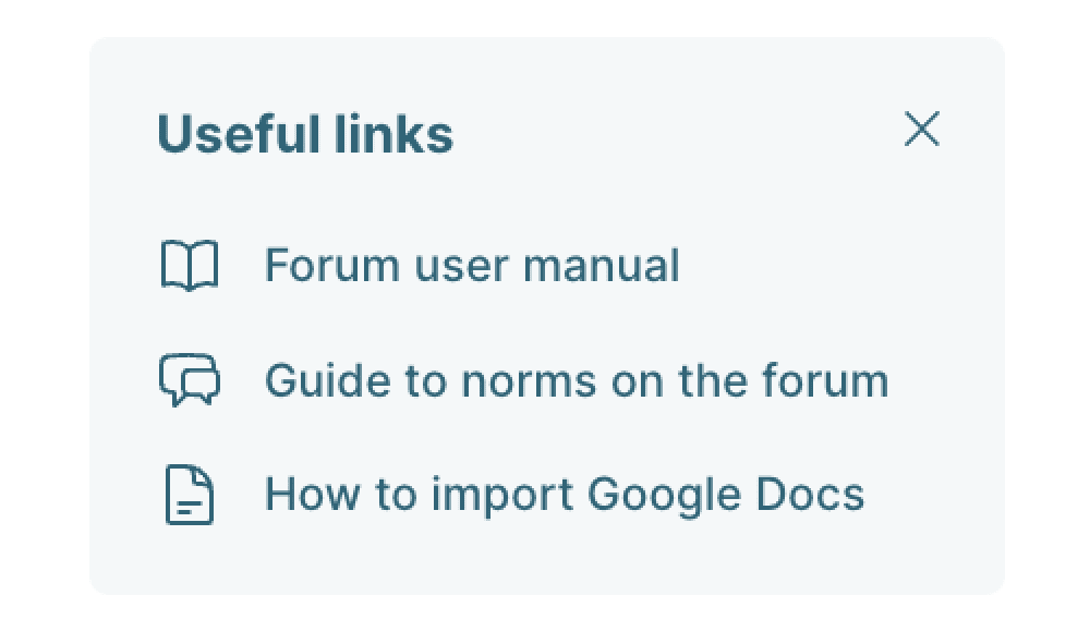
Useful links on draft post pages
We’ve added a small banner in the top right of draft post pages to make it easier to find answers to common questions.
Share your feedback
Let me know if you have feedback or questions about these changes. You can comment on this post or reach out to us another way. You can also share feature requests in the feature suggestion thread.
Thank you to everyone who gave input on these designs, and to the Forum team.

My feature request for EA Forum is the same as my feature request for every site: you should be able to search within a user (i.e. a user's page should have a search box). This is easy to do technically; you just have to add the author's name as one of the words in the search index.
(Preferably do it in such a way that a normal post cannot do the same, e.g. you might put "
fooauthored this post" in the index as@author:foobut if a normal post contains the text "@author:foo" then perhaps the index only ends up with@author(orauthor) andfoo, while the full string is not in the index (or, if it is in the index, can only be found by searching with quotes a la Google:"@author:foo")I like the new linkpost design! It makes me think of the potential of linkposts on the forum.
One possible vision would be to have the forum be a centralized place to discuss any source on the web. Some suggestions to that end:
I like the spirit of the reactions feature although the specific choice of reactions seems quite narrow / unnatural to me? I think two big missing ones from social media are laugh and sad – if you're concerned about being laughing at comments instead of with them you could mitigate it by labelling it something more unambiguously complimentary, like "witty" or "enjoyable"?
I think "changed my mind" is a great one, though.
I would like an option to nonymously react to whether I perceive an argument is good or bad. This will be a good middle ground between "need to write 3 sentences every time I need to explain why an argument has holes or is missing information" and "authors feel like they're anonymously critiqued by people who they have no hope of learning the perspective of."
Thanks folks. It feels really good that when I'm frustrated with something I think, "oh they'll probably fix it or be working on something even more important"
Wow, that’s a lot of new features! Any reason for so many at once?
Some of these features were released last month but only announced now (post reactions and the author improvements). Some features we’re launching together to reduce the amount of times users feel surprised by things changing (right sidebar on the Frontpage, “Recent discussion” redesign, Best of page, etc.). There are pros and cons to both continuous releases and bundled releases, this time we did a bit of both.