Agnes Stenlund
Posts 10
Comments10
🎧 We've created a Spotify playlist with this years marginal funding posts.
Posts with <30 karma don't get narrated so aren't included in the playlist.

I'd love this too, thanks both for pushing this forward. I think it'd be great to have a space similar to the Groups resource centre, but for comms about EA (including visualisations like these). Would probably make sense to host on https://effectivealtruism.org so that journalists, policy makers, etc. can also find and use them. This work could fit within the realms of redesigning effectivealtruism.org too, since a big part of that work is to better communicate EA to the world...
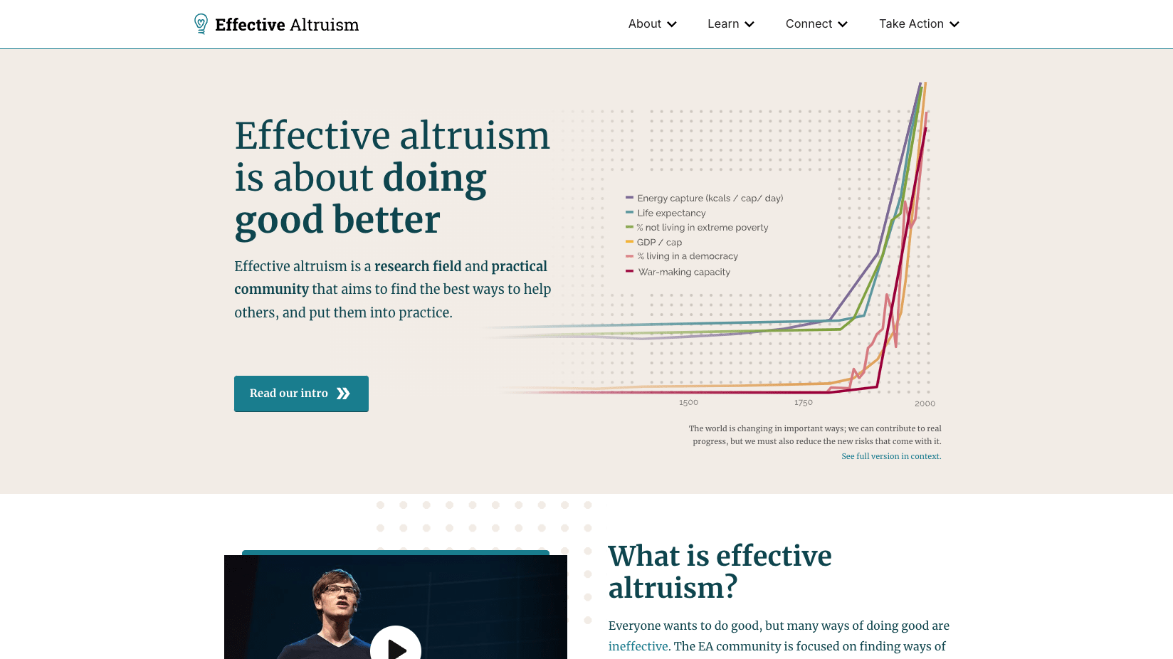
I’m part of a working group at CEA that’s started scoping out improvements for effectivealtruism.org. Our main goals are:
- Improve understanding of what EA is (clarify and simplify messaging, better address common misconceptions, showcase more tangible examples of impact, people, and projects)
- Improve perception of EA (show more of the altruistic and other-directedness parts of EA alongside the effective, pragmatic, results-driven parts, feature more testimonials and impact stories from a broader range of people, make it feel more human and up-to-date)
- Increase high-value actions (improve navigation, increase newsletter and VP signups, make it easier to find actionable info)
For the first couple of weeks, I’ll be testing how the current site performs against these goals, then move on to the redesign, which I’ll user-test against the same goals.
If you’ve visited the current site and have opinions, I’d love to hear them. Some prompts that might help:
- Do you remember what your first impression was?
- Have you ever struggled to find specific info on the site?
- Is there anything that annoys you?
- What do you think could be confusing to someone who hasn't heard about EA before?
- What’s been most helpful to you? What do you like?
If you prefer to write your thoughts anonymously you can do so here, although I’d encourage you to comment on this quick take so others can agree or disagree vote (and I can get a sense of how much the feedback resonates).

Some of these features were released last month but only announced now (post reactions and the author improvements). Some features we’re launching together to reduce the amount of times users feel surprised by things changing (right sidebar on the Frontpage, “Recent discussion” redesign, Best of page, etc.). There are pros and cons to both continuous releases and bundled releases, this time we did a bit of both.
Forum team update: Shortform is now called “Quick takes”, has a section on the Frontpage, and changed in some other smaller ways.
Here’s what’s new:
- Shortform is now called “Quick takes” (Shortform was confusing to many people)
- There’s a section for Quick takes on the Frontpage to improve visibility (you can still post Quick takes that don’t show up on the Frontpage; just deselect the “Frontpage” tag). Those will only show up in the separate view
- Some other design changes to make things clearer and easier to use:
- There’s an input field in the section on the Frontpage, so you can add a Quick take there directly
- Improvements to the page where all of an author’s Quick takes are shown
- Other visual changes to the Quick takes and the creation flow
Rationale/context:
In some cases, Forum users want to share (and read) less polished ideas or other content that doesn’t seem like a full post on the Forum. Shortform was designed years back to fill this gap, but the Shortform feature was tucked away, hard to read, and had a name that most users didn’t understand.
Over the past few months, we’ve been exploring ways to encourage lower-barrier discussions, culminating in this latest version of Quick takes.
As always, we’d love feedback on these changes. You can comment on my Quick take (or email us if you prefer). We’ll also monitor how this feature gets used and improve it over time.
I appreciate this observation, this is something I'd like to keep an eye on. The reason I changed it is because many newer users we spoke to didn't understand why some comment bubbles were blue and some not. I assumed this to be because turning something blue when unread isn't a commonly used design pattern elsewhere on the internet (unless it's a blue circle next to the unread thing). My hope with the new design is that it will be more easily understood as "new and unread" since it uses a pattern more widely known to mean that. That said, I agree with you that it's less eye-catching than before, and if you feel like you constantly miss new comments due to this change, I'd love to know
Thanks for letting us know! Choice of typeface is no doubt a subjective thing and some will prefer the old font. In terms of inconsistency–one of the most popular principles for typeface combinations is the one I've gone with here–pairing a sans serif header with a serif body. This combination can be found online on places like Medium and Substack, and was already the case inside of Forum posts before this change. Typefaces are often even created in pairs of serif and sans serif that are meant to be paired this way.
This is obviously not a hard rule and you may still prefer other combinations (it’s not uncommon to use all sans serif on web, or all serif if it’s a magazine), and I'm definitely open to trying different things to improve legibility and tweak the “personality” of the Forum through typefaces (but it's not something I expect to prioritize changing right now)
Correct! There is a detailed article here about how Inter was made. It's open-source and designed specifically for screens.


Like @Toby Tremlett🔹 I did a quick initial vote and will come back and edit my vote once I've read more marginal funding posts + see who's in the lead.
(Another plug here for the Spotify playlist we created with the marginal funding posts in case you (like me) prefer listening to posts)