TL;DR: “More posts like this one” recommendations at the bottom of posts, design changes to the Frontpage and to feature better info on users’ profiles, and more.
A longer summary:
We’re trialling recommendations at the end of posts as a way to help you find content that is more suited to your interests. This will only appear for a small fraction of users currently, but you can opt in if you want to try it (see below).
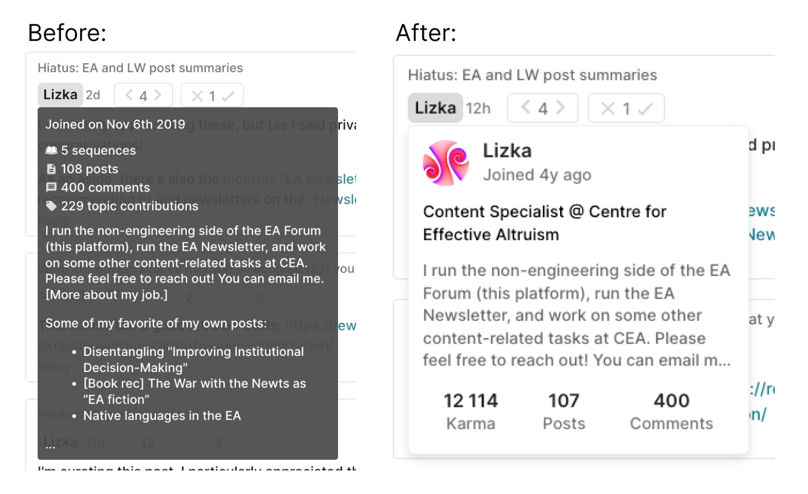
On the design side, we have made a few changes to give more context on other users. We have started showing more info about authors (including profile images!) when you hover over their username. We have also added cute little icons next to the names of new users and post authors in the comments of their posts.
It's been a while since our last feature update, so there are a fair few other changes to go through.
Recommendations at the end of posts
Currently on the Forum it's somewhat hard to find high quality posts that are relevant to your specific interests. The Frontpage is weighted by recency + karma, which tends to mainly surface new posts that everyone likes. Topic filters[1] help with this to an extent but:
- Not that many people use them
- You may not know ahead of time exactly which topics you will be interested in
We are trying to solve this in the only way tech companies know how: with a recommendation algorithm. We’re trying this out on post pages at first because the majority of the traffic to the Forum is direct to posts, and currently there isn’t an obvious “next thing to read” once you have finished the one post.
This is being trialled for 10% of users initially. If you would like to opt in[2] you can go to this page and select "Recommendations on the posts page" in the final dropdown. We expect to make a version of this live for everyone soon.
The recommendations box we have added at the bottom of the page looks like this:
The recommendations chosen are similar posts that you haven’t read before, the main factors that go into selecting these are:
- Being upvoted by the same users that upvoted the post you are on
- Being tagged with the same topics
- Karma
Design changes
Context on other users: icons by usernames and new profile hover previews
We have cleaned up and added more info to the preview of the user’s profile that appears when you hover over someone's name, including showing their profile image:

The two changes here are aimed at giving you more context on other users when you are casually scrolling around the Forum, and generally making the Forum seem (slightly) more friendly.
Frontpage changes (shortform!)
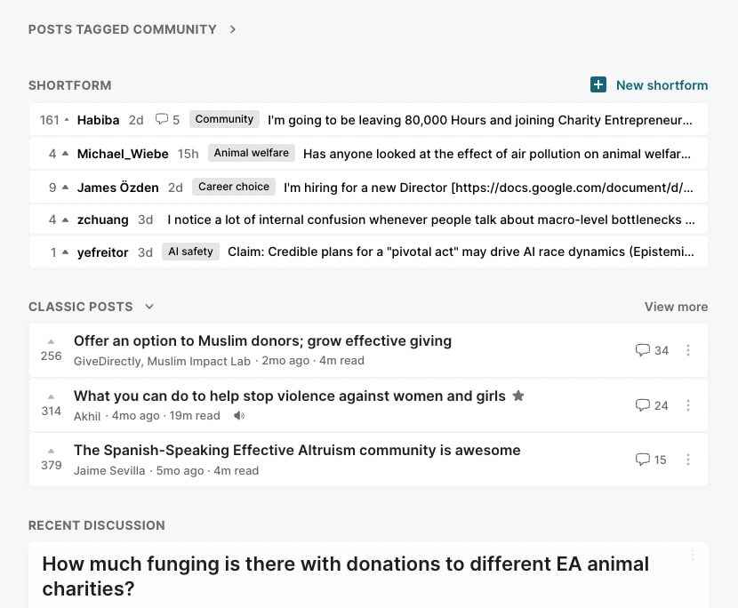
We have added a section for shortform posts to the Frontpage and simplified the “Classic posts” section (formerly called “Recommendations”):
Shortform has been a somewhat sidelined feature for a long time. Some people do use it and I think the things they post are great. But it was (and still is) relatively hard to find. We are experimenting with more changes to give shortform more prominence in the near future.
We also found that the “Recommendations” section was not being used much. We have simplified it, renamed it to "Classic posts" (which is closer to what it actually is), and hidden it by default for logged-in users (you can bring it back by toggling the arrow in the heading for that section).
A brief update on “Community” posts
A big theme of the previous few updates was that we were thinking about what to do with "Community" posts. Community posts tend to get systematically more karma (for reasons discussed here), which means that when they’re on the Frontpage together with other posts, they will crowd the other posts out whether people want to read those or not. People have also reported getting sucked into reading discussions on Community posts when they didn’t endorse this. We had moved them to a separate section, and later collapsed this section and removed comments on Community posts from the Recent Discussion feed under the Frontpage to try to address this.
Since then, the relative amount of engagement on community posts has gone down a lot from the peaks it had reached over the previous few months, possibly due to our change or possibly due to a natural lull in community discussions. We're not sure this is the best long-term solution though. Personally, many of my favourite posts of all time are community posts, and I’m a bit sad to see that they are now getting less attention.
We have added community posts with under 10 comments back into the "Recent discussion" feed as a way to try and keep community discussion as a central part of the Forum without it getting out of hand, and we may make some more changes in this direction in the near future. We're very interested in any thoughts you might have about this.
A separate site for bots
We have an open API on the Forum, and people can and do set up bots to scrape the site for various reasons. This has been causing a few performance issues recently (and in fact for a fairly long time), so we have set up a separate environment for bots to use. This is exactly the same as the regular Forum, with all the same data, just running on different servers: https://forum-bots.effectivealtruism.org/
Shortly after this is posted we’ll start blocking bots from the main site and redirecting them to this site instead.
Cookie banner
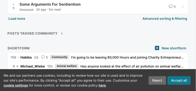
If you live in the UK or EU[3] you will now have to explicitly accept the use of cookies. This enables a few things, such as google analytics and remembering whether you have toggled various sections open or closed. You can read our full cookie policy here.
Assorted other changes
- There is a rudimentary read history page(!) which shows the most recent posts you have clicked on
- Comments on posts are now sorted by “new & upvoted” by default (rather than “top”)
- Footnotes will now be collapsed if there are more than 3 of them
- Lots of other design tweaks:
- The top of core topic pages have been redesigned
- The comment box is now a lot simpler
- Buttons are now in sentence case rather than upper case
Please give us your feedback
We’re always interested in getting feedback on the changes we make! You can comment on this post with your thoughts or contact us another way.


I would suggest keeping the recommended posts optional. I like them a lot, but I worry they might keep me on the forum too long. They can definitely be on by default.
Thanks for the suggestion! We'll add a user setting for this 👍
Also for the /graphql endpoint? Anyways, moved forum.nunosempere.com to that endpoint. But I'd expect this to be a small burden to others running their own stuff.
Yes this applies to all requests including /graphql. If the user agent of the request matches a known bot we will return a redirect to the forum-bots site. Some libraries (such as python requests and fetch in javascript) automatically follow redirects so hopefully some things will magically keep working, but this is not guaranteed.
I appreciate that this is annoying, and we didn't really want to do it. But the site was being taken down by bots (for a few minutes) almost every day a couple of weeks ago so we finally felt this was necessary.
gg
Following up on this: we've expanded the Community section on the Frontpage to show 5 posts instead of 3. Nothing else should have changed with this section right now.